
4 Photographs of each 16 in all
Colour harmony through complimentary
Colour harmony through similar colours
Colour contrasting through contrasting colours
Colour Accent using any of the above
Just looking back over this course. To get some scope on what I am aiming at . I notice in some cases, in the book, that from pages 92 to 93 Not all colour is not true. Enfaces on the tree with the orange back ground. in fact the shadow is dark orange and not red . Same with the opposite sea scape has golden yellow , To me this does not render Purple, Move in any way, but for the little strip in the Horizon.
Feeling puzzled to my aims . I endured to understand the point of this exercise. Shot these pictures, and found that I still am not thinking of the matters that counts for a picture. Although I have been told I take good photographs . Some elements are still missing., I now realise, in each course I take, I take on another element, and have to ad when taking a photograph, so to make that picture stand out from any other.
Its not merely viewing the subject and taking the picture, or moving the camera to gain some composition. Factors of many are taken into account, to put the picture together. A form of psychological balance of colure, shape and imagery to lead or fool the viewers eye. To manipulate what you want the viewer to understand and read.
I wrote down all the elements required for the assignment. I keep a camera with me where ever I go now. be it SLR or compact. This way a shoot what I see and feel may be used in future assignments . Planning ahead is important. I made notes to what I have to do. But when approaching the goal. I found this matter much harder then I expected. I found that the world is dominated in RED GREENS AND BLUES AND YELLOWS. However to find these colours as asked for this assignment, became a little more frustrating to put together.
My results.
Complimentary colour Yellow and Violet :
Here I searched for a different natural form from what I had achieved in the previous exercise. Although the flowers take about1/4 of the frame the colour clearly compliment with the yellow. The yellow framing the violet and boosting their impact. To capture this ocular is quite difficult . When I uses a compact. The task when even harder to reproduce the depth and richness. So some adjustment was made. The flowers I found above my the parking space at home on the fence . Using shallow depth to separate the back drop of yellow.


 Green and Red.
This one has given me a problem to find a picture that is not the same, or like others I have taken, To find these, other then using flowers, or fruits, became a challenge. Here when photographing street in Manilla . I noticed two working men wearing opposite colours that complimented. Taken from a moving van. I had to crop the picture and adjust contrast to bring out the colour.


A morning in the hot sun In KK. The sun rises and becomes very hot fast. But still holds a warming tone. Even then the colours were a little strong, some warming was aded to get this tone. Final result of Greens Blues yellows. Blending mans creation and nature. The Colours here graduate nicely .

Although some of the samples in the program had described similar colours. Using warm tones of the original colours, and for the task was to find your OWN exact colours that your looking for. I could not help capturing this building using the three colours that here compliment, and are, I feel contrast in strength. But also using similar colours using green and yellow that make Blue.
has a nice Rhythm too.


Last off all of this assignment in the task of ACCENT!
A number of photos were taken. But my aim was to get the extreme. From discarded coke cans, in green grassy waters, to a man waring an orange shirt against the bright green wall. All seemed similar to the above.
Needing more impact of colour, I have taken out the red. Air Asia plain against the blue sky. I was going to use this, and submitted this one of blossom . Cropped to lesson the amount of yellow . I feel the yellow and blue have a much a better relation then red and blue, when this bright.


Colour harmony through complimentary
Colour harmony through similar colours
Colour contrasting through contrasting colours
Colour Accent using any of the above
Just looking back over this course. To get some scope on what I am aiming at . I notice in some cases, in the book, that from pages 92 to 93 Not all colour is not true. Enfaces on the tree with the orange back ground. in fact the shadow is dark orange and not red . Same with the opposite sea scape has golden yellow , To me this does not render Purple, Move in any way, but for the little strip in the Horizon.
Feeling puzzled to my aims . I endured to understand the point of this exercise. Shot these pictures, and found that I still am not thinking of the matters that counts for a picture. Although I have been told I take good photographs . Some elements are still missing., I now realise, in each course I take, I take on another element, and have to ad when taking a photograph, so to make that picture stand out from any other.
Its not merely viewing the subject and taking the picture, or moving the camera to gain some composition. Factors of many are taken into account, to put the picture together. A form of psychological balance of colure, shape and imagery to lead or fool the viewers eye. To manipulate what you want the viewer to understand and read.
I wrote down all the elements required for the assignment. I keep a camera with me where ever I go now. be it SLR or compact. This way a shoot what I see and feel may be used in future assignments . Planning ahead is important. I made notes to what I have to do. But when approaching the goal. I found this matter much harder then I expected. I found that the world is dominated in RED GREENS AND BLUES AND YELLOWS. However to find these colours as asked for this assignment, became a little more frustrating to put together.
My results.
Complimentary colour Yellow and Violet :
Here I searched for a different natural form from what I had achieved in the previous exercise. Although the flowers take about1/4 of the frame the colour clearly compliment with the yellow. The yellow framing the violet and boosting their impact. To capture this ocular is quite difficult . When I uses a compact. The task when even harder to reproduce the depth and richness. So some adjustment was made. The flowers I found above my the parking space at home on the fence . Using shallow depth to separate the back drop of yellow.


This one has given me a problem to find a picture that is not the same, or like others I have taken, To find these, other then using flowers, or fruits, became a challenge. Here when photographing street in Manilla . I noticed two working men wearing opposite colours that complimented. Taken from a moving van. I had to crop the picture and adjust contrast to bring out the colour.


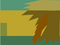
Orange and blue
Finding the Proboscis monkeys at sun set against the back drop of blue. Much less volume taken here . The balance is pleasing . However the colours rendered a much lower tone , being that they were taken at dusk with the setting sun. So I brightened the hole frame, to bring out the orange and Blue. Here in Borneo , when I aim to find the picture I am after. I have to work fast, as Mid day produces harsh shadows. The colours on a cloudy day tend to have no depth. So 2 hours before sun set time or before a storm is about the best time.


Orange and blue.
Was a little hard to locate. These two colours together . I feel often red and Oranges are taken as the same. Equal to each other complimenting blue and Orange, I have cropped out much of the overhead and under side of the picture. To frame the the colours, blue and oranges closer. And adjusting contrast , Exposure , Brightness, and also temperature. To give richer denser colour. I think these tones of the same ratio work well to harmonise one another. As the photo when I took it, had accent in mind. Due to the composition, this did not work well due to clutter, I had to cut out. Linking the balance of the two colours. Persuaded me to use this image for this reason.


Colour harmony through similar colour
Reds blues yellows Shades that blend, give a warm softness to this picture, complimenting the resting kitten below. The warmth of the fawn helps graduate the colours, to the front of the frame. Similar colour, as the colours that are not opposite on the charts, and also off shade with a warmer tone .


Green and Yellow. Looking hard at this. To find colours that do not become opposite as in complimentary, But off set on the colour circle. I felt this one balances nicely . Wondering through the City of kotakinabalu , the view through the trees, backed by the yellow building, is most at ease with the green as a hint of blue, from the window reflecting the blue sky ads to the mix .


A morning in the hot sun In KK. The sun rises and becomes very hot fast. But still holds a warming tone. Even then the colours were a little strong, some warming was aded to get this tone. Final result of Greens Blues yellows. Blending mans creation and nature. The Colours here graduate nicely .


Although some of the samples in the program had described similar colours. Using warm tones of the original colours, and for the task was to find your OWN exact colours that your looking for. I could not help capturing this building using the three colours that here compliment, and are, I feel contrast in strength. But also using similar colours using green and yellow that make Blue.
has a nice Rhythm too.


Contrasting colours.
I actually love contrasting colour. Those that stand out from one another .
This rap, tucked in the Owning cords, Bright orange, agains a gentle shade of greens . Especially the darker toned more to true green, boosts the colour Orange . I had to move some people to get this picture.


Violet and green.
On the circle of colour, I note that the three contrasting colours, linked by a triangle . Where orange, Violet and Green link. And Blue yellow and red Link
Oddly enough I find that linking the colours Red yellow and blue in everyday life was somewhat harder then I thought. Some yellow and reds or blues and reds.
To move away from the colours I have used before was also difficult. So I have opted to use this picture. I took in my favourite place , the market.
Violet and green. Sadly no Orange .


Contrast again of similar colour material. Broaches in the market stall, made into butterflies, captured my eye with this vibrant rich contrasting colour. The move or Violet seem to be the in colour in Malaysia right now. And I have captured so many pictures including this colour.


These buckets caught my eye in a shopping mall
The contrasting green, blending with the red, and blue back dropped, by the terra cotta deep red.


These buckets caught my eye in a shopping mall
The contrasting green, blending with the red, and blue back dropped, by the terra cotta deep red.


Accent .
A small or direct point of colour, or object that distinctively stands out from all other elements in the picture. With the following picture. With one small object placed or appearing in a void of colour. Placement plays an important roll / Where to put the subject?
In most cases left to right 2/3 or 1/3 depending on the structure of the back ground. I did my best not to repeat or make the subjects repetitive.
Nevertheless This Is what I managed to produce.
First . A Flower of Red, Orange immersed in Green.


Along the sea front of KK. Many people stand and fish.
I had to use the full length of my lens to capture and avoid other objects, entering the frame. Here, one boy stands in red with his red dish. Pensively waiting , taking the subject to the left as he was facing right, took this composition into Accent.


A small or direct point of colour, or object that distinctively stands out from all other elements in the picture. With the following picture. With one small object placed or appearing in a void of colour. Placement plays an important roll / Where to put the subject?
In most cases left to right 2/3 or 1/3 depending on the structure of the back ground. I did my best not to repeat or make the subjects repetitive.
Nevertheless This Is what I managed to produce.
First . A Flower of Red, Orange immersed in Green.


I had to use the full length of my lens to capture and avoid other objects, entering the frame. Here, one boy stands in red with his red dish. Pensively waiting , taking the subject to the left as he was facing right, took this composition into Accent.


Sweets still life
Gummy bears
My fist endeavour when thinking of the subject was to create. Accent from using similar colours, as there were not enough green. And red that throws its self at any on looker. Could I say contrast, or clash. Its bluntly obviously saying I want to be eaten.
I fist used available light . The over all subject was to dull. So I then used flash. Ring Flash with 60mm macro


A number of photos were taken. But my aim was to get the extreme. From discarded coke cans, in green grassy waters, to a man waring an orange shirt against the bright green wall. All seemed similar to the above.
Needing more impact of colour, I have taken out the red. Air Asia plain against the blue sky. I was going to use this, and submitted this one of blossom . Cropped to lesson the amount of yellow . I feel the yellow and blue have a much a better relation then red and blue, when this bright.


