
Taking 4 -6 photographs that are lighter or darker, and explain why they are so.
So here are pictures that are darker .
photo 1 :
By stopping down once and then twice . I found the mood I was after . You see how a darker image with bright high lights sets a mood. Making the feel, more relaxed. keeping detail in the high lights and in the shadows.


Darker 1stop down 1/3 down Average 1/3 lighter 1 stop lighter open
So here are pictures that are darker .
photo 1 :
Darker
Read the Exercise looking at what to take. I know I had already taken some for the task at hand. However . The lights rays beaming side ways, gave me this : My grinding pot. Full of texture . Meter reading in SLRs are set on an average like the grey scale . And the first exposure just looked like a Pot in a catalogue . Bland, and no mood. No shadow , Mood is what i wanted to capture. like thos cottage food photographs.By stopping down once and then twice . I found the mood I was after . You see how a darker image with bright high lights sets a mood. Making the feel, more relaxed. keeping detail in the high lights and in the shadows.

Lighter
Big Bean: To be able to capture this shot of my nephew, and a big jungle bean . I had to open up the aperture. This was to make the shadow show detail of the big bean, , in doing so bleached out some of the back ground. What I could have done was balanced the flash for fill in. By exposing for the shadow with the back lit scene. The the background has been almost lost.
Darker
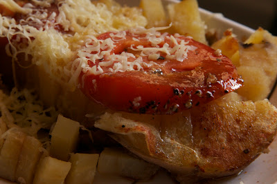
This photo of a quick meal I nocked up, took with the 30d
In doing so, noted how the food looked unappealing on normal exposure. I stopped down about 1.5 stops for two reasons. To get more depth and to darken the image making the high lit parts more apparent , making it look tasty.

lighter
The Orang Utan, when I took this photo, it was in it self quite dark So I lightened it to bring out the shadow area. But the back ground as in the photo above loses its detail. dark subjects, back lit, always give a challenge.

Darker
This naturally dark photo taken at night of a girl in thought lit with just an out side florescent light. I have named: Pensive.
Exposing for the skin tones letting the rest fade into darkness. Capturing the image as the eyes see it.

Darker
This photo taken along the seafront of kota kinabalu.
Stopping down to darken the picture, makes the storm look more dramatic. At normal exposure , the suns rays would have been lost, and more detail would have been seen in the boat .

Next under, over exposure :
Section 2
Taking 5 to 6 photographs . Bracketing from 1 stop down 1/2 average exposure 1/2 stop up 1 stop up.
This is not accurate, as the 30d does not have 1/2 stop increments only 1/3 so i have use 1 stop and 1/3 + or -
To save up loading loads of photographs that would like forever as my broad band has now cut my usage . I am using contact sheet type screen shots of the results .
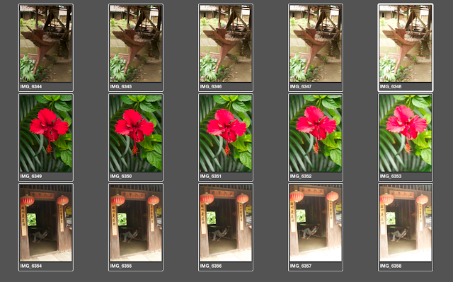
Some good examples here to show the difference in exposure and harsh conditions, and normal conditions. Taken at the Culture Museum, here in KK.
Thoughts in taking these pictures, and my feeling towards todays digital photography. Its well worth taking the time on static objects to bracket your exposure to get the best result.
In the film days, with transparency we had to bracket or spot meter . As latitude of the film was restricted. Film however had the more wider latitude to play with.
So digital honestly has no excuse for bad exposure with the wide range of manipulation in the camera or software.
You will note, depending on the mood and what your intent to portray, depends how you expose. Opening up, to gain detail in shadow areas . Stopping down to expose for back light, and gain mood. The red flower shows much better stopping down giving richer colour.

Darker 1stop down 1/3 down Average 1/3 lighter 1 stop lighter open
Top middle average, top 3rd picture. I like and the 4th. :6346 and :6347
Middle same frame.
Bottom left, again the same. Using the 30D, I tend to top down on most pictures of 1/3 to give richer tones.

Darker 1stop down 1/3 down Average 1/3 lighter 1 stop lighter open
Looking at the above. The far right, Top, would be the better for detail in the subject, 6333. The picture before: 6332 balances better.
The far left middle: 6334 of the old mangle could even take 1/2 a stop more down, with a bit of contrast to bring out the texture.
Bottom 2dn picture seem right. 6340
No comments:
Post a Comment