Assignment 4, Applying lighting technique.
- Shape
- Form
- Colour
- Texture
To Photograph any subject, to show Shape, Form, Texture, and colour using all the skills I have learnt . Any subject that can be moved for photographing in different lighting conditions .
Here I have chosen a wooden carved Buffalo. A symbol of Malaysia Borneo.
Photographing the subject as written : 8 photographs :
Shape:
Taken on a table top, lit from window light behind. Stopping down by 1 stop, to rim light the subject, and darkening any detail., As the light dims in my apartment. Shadows and colours change. Capturing what you see, and want to portray in a photograph, takes quick thinking of adjustment of the camera. Nature will not wait.
In this subject I wanted to separate the back ground , so I focused on the rim lit area 2.8 making the out line more pronounced .
Shape
Low silhouette taken in very low dark light as in subdued lighting. Showing shape, this picture was darker. So to enhance the back lit wall from the low lighting. I brightened and aded a hint of warmth.That would have been noticeable at the time . I like this very much, as the direction and positioning ads to composition. I think enlargement on a wall would give a much calming feeling.
Texture and colour making form:
Lit from the setting sun, shining through the window. Front lit on a tripod. I had to work fast to set this up. The light was dropping fast. As It does here in Borneo. As sun light lowered, I watched the casting light from the window move along the wall. Inspired by this beautiful light , I moved quick to grab my carving . Setting up on a chair , At first, to much wobble needed some card board laid across to make a small table top. My black cloth thrown over the back of the chair to make a backing.
The camera needed to be on the try pod. As exposures were long. and I required depth . As you can see from the camera setting below.
This orange light I found acts like an orange filter in Black and white film, bringing out the grain of wood, showing of this carving in its true form.
Form re done from fist submission:
This photograph was taken on location .
The day was early, and overcast. Some Mosquito repellent and set to the task. My tutor on my first set said what I had taken was good. Just seemed to point that the images were to much the same. So this one , I took laying on the floor. Then over head. on top of the car. But to much clutter in the back drop .Trees and wires . So I tried the table.
Just did not seem right. I could not get low unless the window of the house came into frame.
I looked at the bank wall. with the shoe stand. Moved the shoe stand away from the wall to give some separation . Made some space . The wide angle lens I use allot when doing culture photography. A feel it gives that national Geographic look. the hardest part as viewing and positioning to frame the carving just right.
Taken with a 10 to 22 mm WA to fill the frame showing a different perspective of form . Stopped down to get maximum depth. Lit by day light, out side on a cloudy day.
I like this picture, from the rest as it fills the frame . Showing all elements .
Colour :
Again making some changes from my previous picture . As my tutor comments were that I had to many the same angle . The above, and this one I took later in day light . This gives a definite example of the colour of the wood. At the same time showing good detail of the back view of the carving.
Colour
Side shot lit from window light on a cloudy day from the right side . Giving a softer light, thrown over the subject, surrounded by the white wall, and slight fill in from the back. Right side. I had attempted to lighten the image . in doing so would have lost this richness and nice Bronze look
Texture:
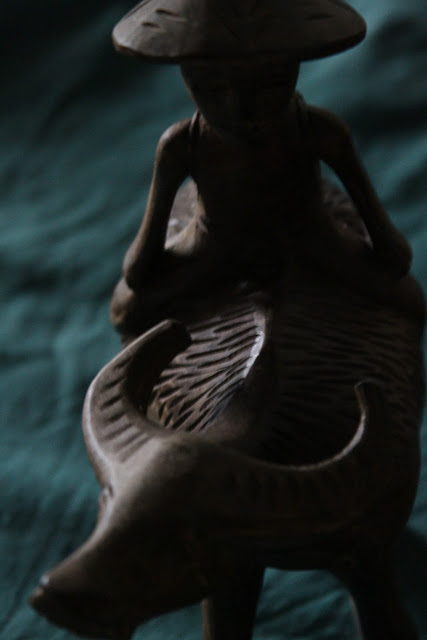
Lit from low darker light, on a very dark cloudy day in my apartment on the table . Window light can make some interesting lighting, if you watch it .To take this I wanted to bring out the texture. Instead of taking the hole subject into the frame, I moved in close. Paying attention to detail and composition. Allowing the back ground to drop off. By positioning both the camera and subject, so the back drop faded away into the darker part of the room. I could have used the back drop again. But one more moment and the light would have been lost.
Texture
Texture at a different angle, in low dark side lighting.
Again working, thinking fast. How to make this different.?
I first took this, on just the table. With its glass top and under lace pattern , The hole image looked ammeter and snappy. Iv shown the texture of the wood on the little man. Now to show off the Texture and detail in the carving. Grabbing my green T shirt , spreading it over the table. To show of the wood more. I gave my self another problem.
Framing. And angle , Not to include the edges of the shirt, so it was not obvious the back drop was an old T shirt.
Turning the carving and taking 3 or 4 shots. I finally got this pleasing image showing texture.
I feel that there may be a lot of shadow here , but using the fill card would have softened the carving making the shadows in each carved knife cut less effective.


No comments:
Post a Comment